|
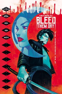
Written by Manuel A. Carmona  We took a short brake but we're back at it with Truthful Reviews! This time we're reviewing the stylish horror book Bleed Them Dry #1 published by Vault Comics! Written by Eliot Rahal with art by Dike Ruan, colors by Miguel Muerto and lettered by Andworld, this book is a great entry into Vault Comics' horror line. Based in a futuristic setting, Bleed Them Dry introduces readers to a much different World where Vampires and Humans co-exist in relative peace, but things are about to change. Some vampires, or "immortals" as they're commonly referred to; are good and some are bad... just like human beings. Someone is killing vampires and Detective Harper Halloway has been assigned to solve the case, but in order to solve it she'll have to uncover a much deeper truth; the future of humanity has been edited. Also... the book ends on a nice cliffhanger. ;) The writer is good at building the character's motivations, making them believable as well as establishing the World they inhabit. The art is dark and stylish, the setting looks futuristic as well as "traditional" when it has to be. The people look different and believable, the vampires look scary, the book looks great. I know artists usually don't like having their work compared to other but to try and give you an idea, the line art has a flavor similar to Pepe Larraz; and that's a good thing! The colors tie everything together quite nicely. I'm sure Miguel used computer colors on some parts but I'm not so sure he did everything on his computer. As a matter of fact, I wouldn't be surprised if he colored the book with watercolors or even high end markers and then went over them and added details on the computer. I say this because when you create art, you notice brush strokes, marker strokes and/or textures. Those details are usually far less common with computer coloring although there's some creators that manipulate computer coloring programs to make it look and "feel real". Maybe Miguel is one such creator but I'm leaning towards him using traditional media in conjunction with computer coloring, all that to say this; the colors look great! Last but not least is the lettering on this book, which is very well done. There are different fonts to differentiate captions with word balloons and/or characters but it's all readable, the words are easy to understand and the lettering does what good lettering is supposed to do; allow the person to read the book effortlessly and not distract or take away from the artwork. All and all, and this is coming from someone who's just starting to delve into horror comics; this book was an entertaining beginning to a much larger story and I'm going to be reading this for as long as Vault Comics publishes it.
0 Comments
Leave a Reply. |
Categories
All
Archives
May 2024
|
Proudly powered by Weebly


 RSS Feed